
Enhanced User Interface

We have improved the UI of TPS v6 by
changing its theme and make it look alike Window 10. The purpose
behind changing the user interface of our product is, at today's
time, more and more people are window 10 users, so to go with the
flow and to match the compatibility of window 10, we have made the
following changes:
Theme changed:
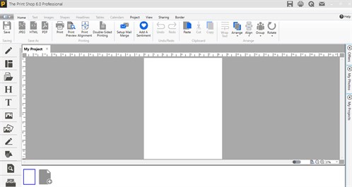
We modified the theme to
windows 10 and to give TPS v6 a completely new look, we use a
third-party theme i.e. Metro App. By applying this theme our
product looks totally different from other TPS products. Now it
looks like Windows 10
Animation on Windows
Opening:
In the opening of every Window in
Print Shop 6.0, the animation is added, which slides the respective
window from right to left.
Flat Buttons and Icons as per
Windows 10:
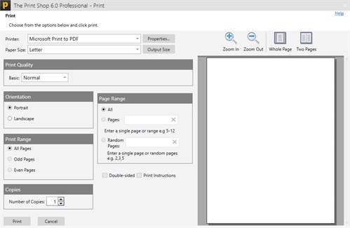
Nowadays, flat buttons and icons
are in trend and very much liked by all, so we have changed our
buttons and icons as per Windows 10 theme
New Ready-Made
Project Window:
In this version, we have
updated, the home window of ready-made projects. We add new
ready-made project tabs in this window so that, users can easily
find his/her related templates
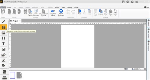
After click on ready-made
project selection button.
pic
here..
New Blank
Project Window:
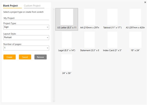
In this version, we
have updated, the blank project windows for the ease of users. Now
they can easily create blank projects.
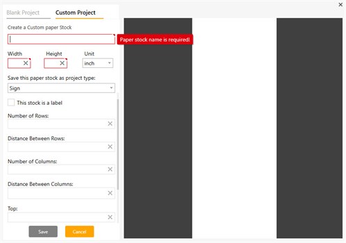
New Custom
Project Window:
In this
version, we have updated the custom project windows, for the ease
of users. Now they can now easily create custom
projects.
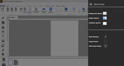
Flyout added like charms in
Windows 10:
In this UI version, classic effects
like flyouts are added in order to send any project by Gmail or try
to open quick access.
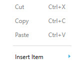
Flat Context
menu:
UI improved context menu is added in
this version, it is totally changed from the previous menu because
icons are neat and in good pixels.
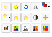
Flat hovers
tools:
Hover tools are flat and give windows
10 UI feel.
Back to What's New in This
Version...
or
Continue
to New Import Pages and Elements from other projects...