Lining up text is simple when just
typing a paragraph. However, when designing a project such as
a menu or a wedding programme, lining up text requires more
planning when you want sections of text to appear in columns.
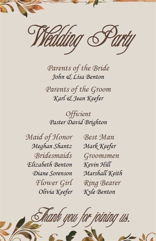
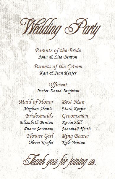
For example, here is a wedding
programme I designed in The Print Shop. Notice how perfectly
aligned the text is where it starts Maid of Honor.
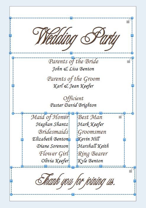
This is accomplished by using multiple
text boxes. You can see that I have 5 text boxes on this
page.
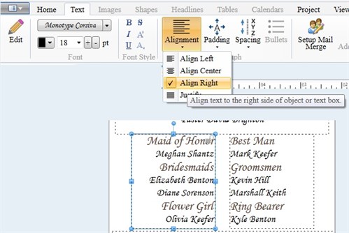
Use the Text Alignment
options to justify left, center, or in this particular text box, I
choose Align Right.
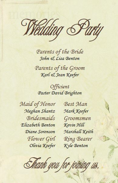
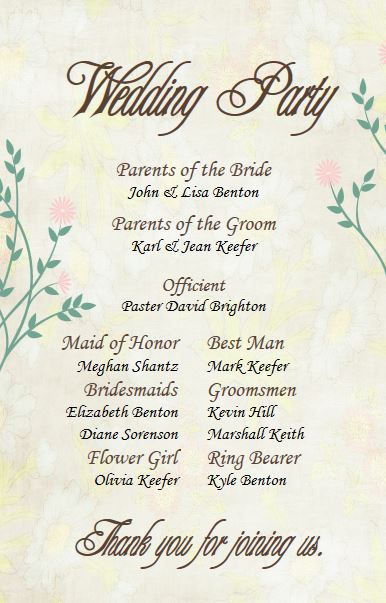
With the extensive clipart gallery,
there are endless design possibilities!
written by lindarobin